
The pandemic took so much away from us. But at least there were some positive outcomes and trends that have a positive impact on our lives. OOOffice is a good example for the positive effect.
Two families came up with the idea to create a new type of coworking office in Hungary. During the first wave where they faced the positive and negative sides of the unlimited home office, they started to think about the concept of an open space – open terrace covid and spirit friendly environment, where people (especially digital nomads) can work in a complete new fashion.
They started their first season in Nagymaros @Piknik Manufaktura by the name OOO (out of office) Campus. They had an honest branding with organic growth.
The self made image and visuals truly represented their essence.
The concept became an instant success and quickly developed into something even more interesting. The coworking place due to its perfect location away from Budapest and only 82 steps away from the sandy beach of the river Danube, quickly transformed into a workation resort where everyone can spend more days in the region and still get the job done.
These organic changes needed to be implemented into their look for their second season.
Project
OOOffice – Out of Office Rebranding
Client
Regional Small Businesses
Added layers
Design Rebranding
Social Media design
Photo Campaign
Image Video
Task
Due to the success of the concept the team started to negotiate about transforming into a franchise system, where the appropriate places that have the necessary workation qualities can join in and start their own workation offices.
A new business needs a new look.
Solution
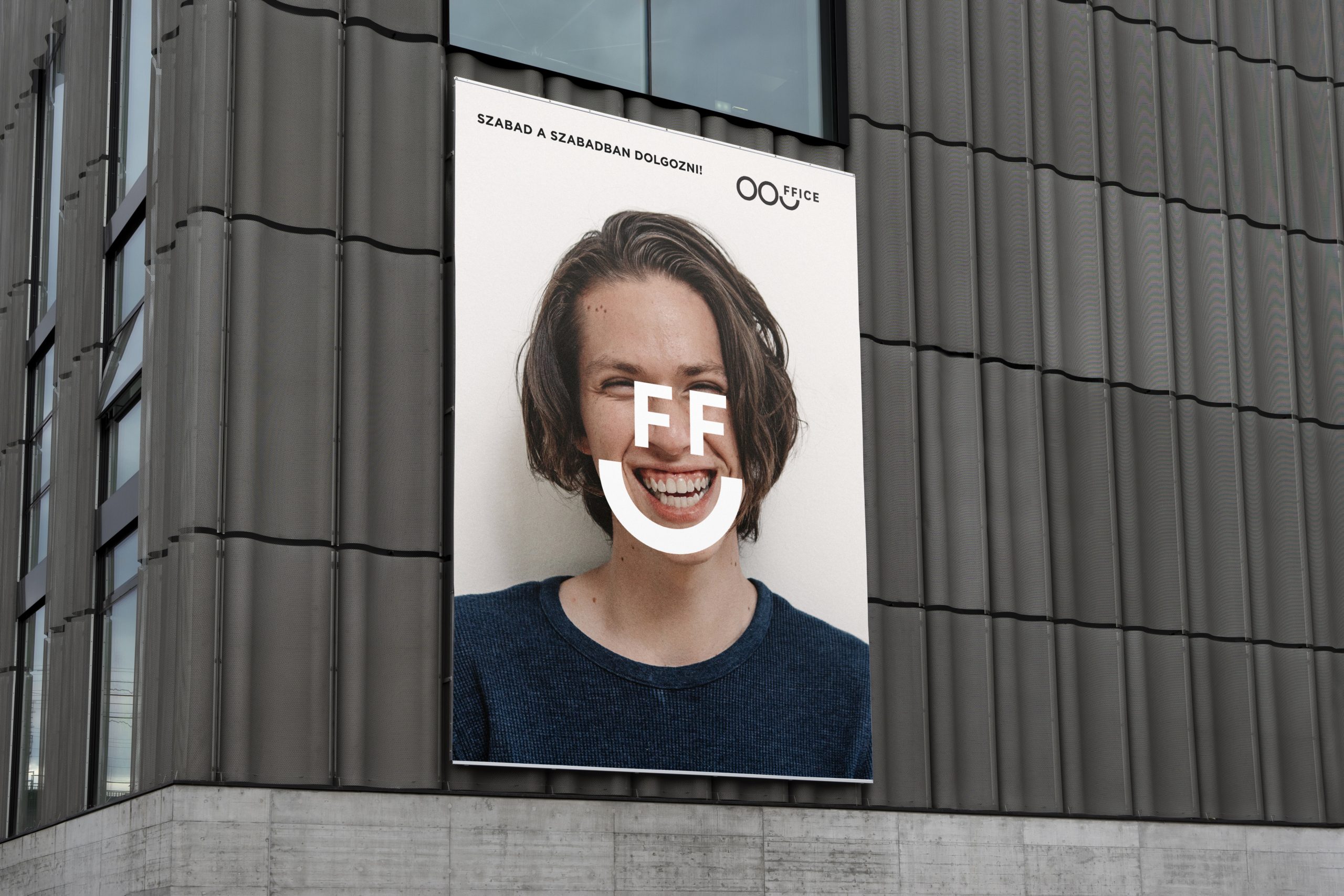
We had the privilege to rethink the name and logo of the successful concept of the first hungarian workation office.
To be consistent we kept the well known three OOOs, but omitted Campus part of the name as it was too difficult for the customers to pronounce it next to the Out of Office abbreviation.
To represent the hospitality and warm feels of the brand we gave it a smile.
As the brand has a strong social presence we had to come up with a simple logo.
The minimalist approach made it possible to use the logo in short and long form.
The colors are fresh and represent summer in the Danube bend.
Campaign elements
Logo design
Social campaign
PR Support